01
Brutalist, not bog-standard
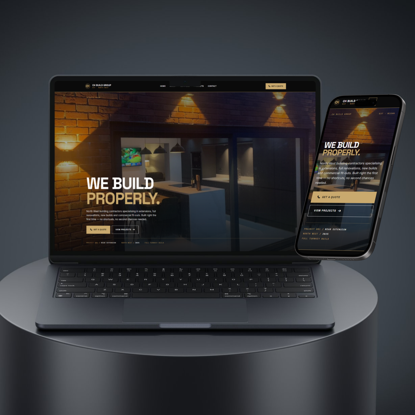
Most builder websites look the same — a stock photo of a hard hat, a grid of service cards, a contact form. We deliberately went the other way. CH Build Group got a brutalist, architectural design language: oversized numerals, hard grid lines, generous whitespace, and a black-and-gold palette that reads like a premium property brochure rather than a Checkatrade listing. The brief was “different rather than bog standard” — so the whole site is built to feel structural and confident.