01
Distinct from Mako, but family-related
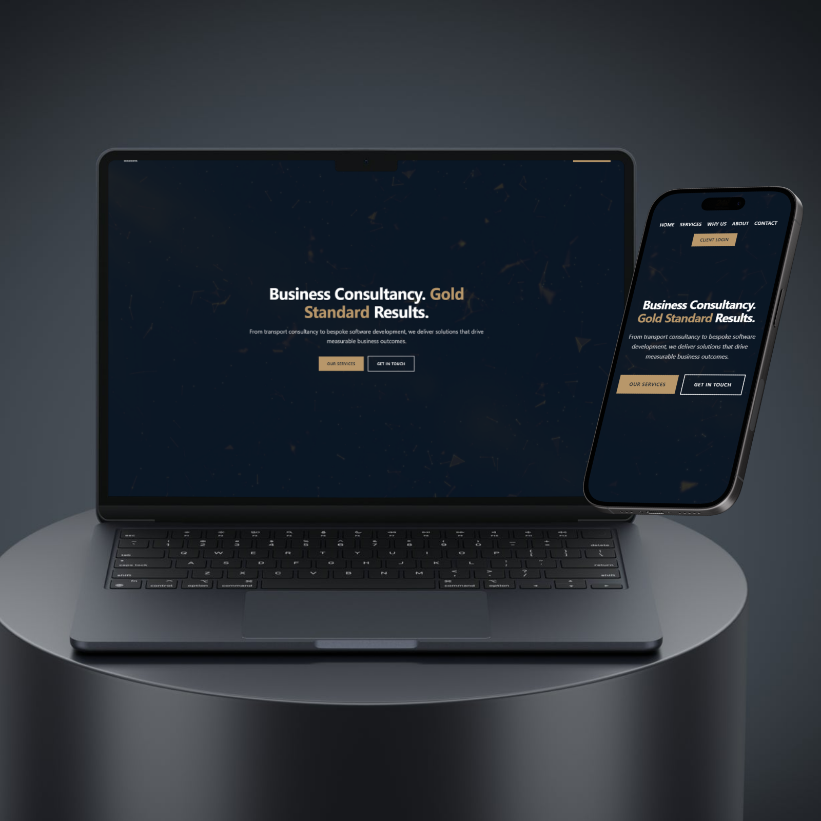
The 24K site needed to read as a separate brand from Mako Digital while still feeling like part of the same operation. We solved this with deliberate visual differentiation: a more corporate typographic hierarchy, video-hero opening, and a tighter palette that signals enterprise software rather than creative agency. Visitors can switch between the two sites and clearly understand the relationship.